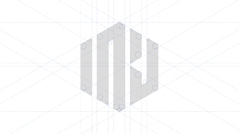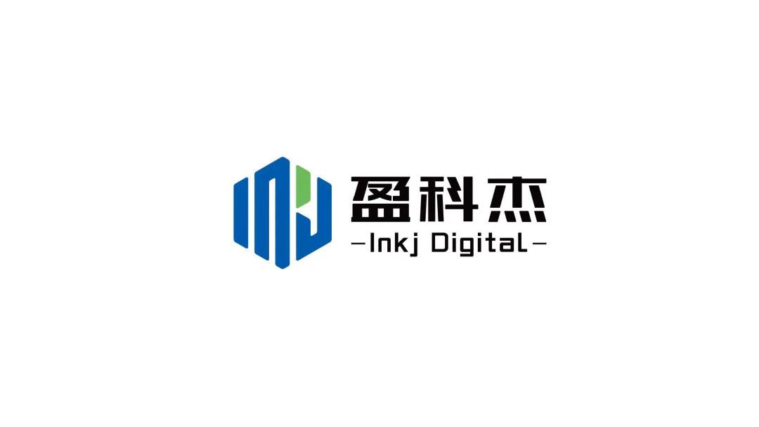
The inspiration of Yingkejie LOGO design comes from the cross-section of a [nut], which presents a hexagonal shape as a whole. Li Bai's "Ancient Style" has a cloud: "The king of Qin sweeps Liuhe, and the tiger looks at him." Modern Liuhe means up, down, left, right , front and back six directions. It means that Yingkejie focuses on the six core concepts of independent research and development, technological innovation, intelligent manufacturing, professional service, green environmental protection, and high-quality intelligence, and shows Yingkejie's quality core and genes. It also shows the craftsman spirit of each Yingke Jie person who bears hardships and stands hard work, strives for perfection, and concentrates on the essential work.

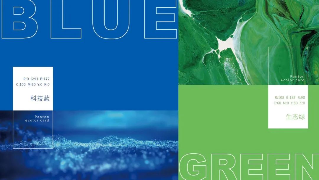
The color application of Yingkejie brand LOGO continues the combination of the brand's iconic blue and green, and at the same time adjusts the color saturation, using two colors of "Technology Blue" and "Environmental Green", the color is more saturated and can better reflect Yingkejie's color. Positioning and Culture.

The design of the LOGO is based on the English abbreviation "INKJ", and the shape has been converted from right angles to rounded corners. The brand LOGO combines the Chinese and English names of Yingkejie, which shows Yingkejie's determination and perseverance in providing inkjet printing solutions to global users. The Chinese font retains the words "Yingkejie". This design combining technology and art is visually more concise and powerful, making the overall LOGO more stable, heavy, harmonious and aesthetic.
Copyright © 2022 High Speed Inkjet All Rights Reserved. 地址:No. 1100, Shunfeng Road, High-tech Zone, Jinan City, Shandong Province 鲁ICP备19052330号 XML地图